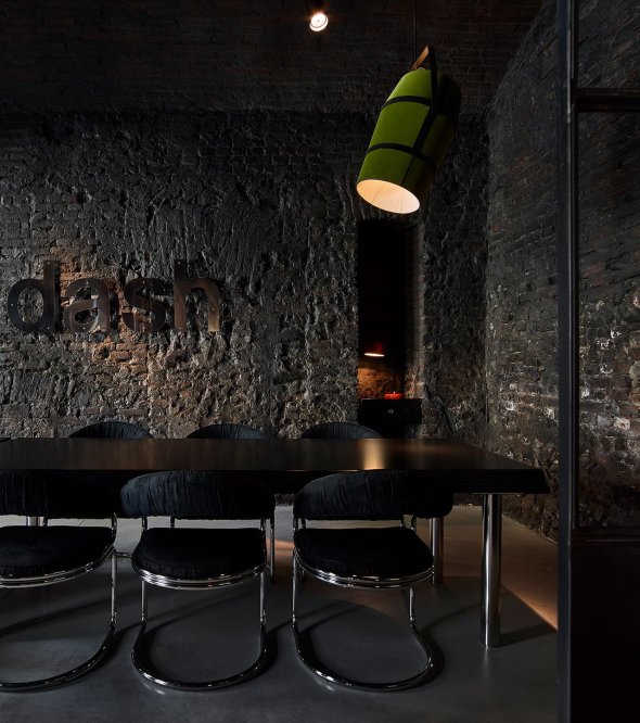
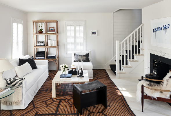
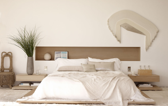
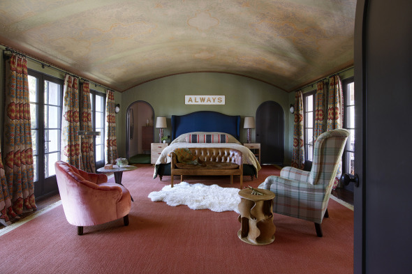
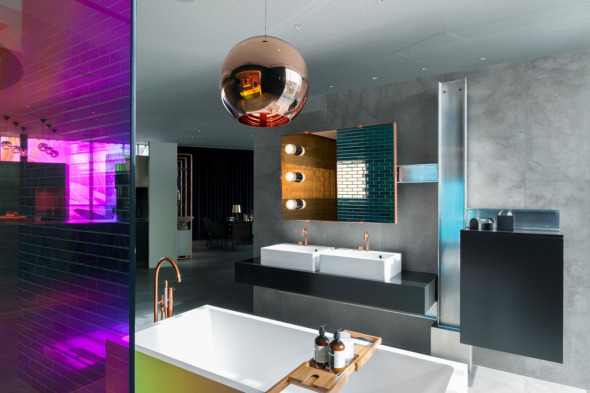
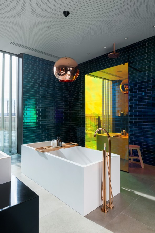
Red, White, and Blue…
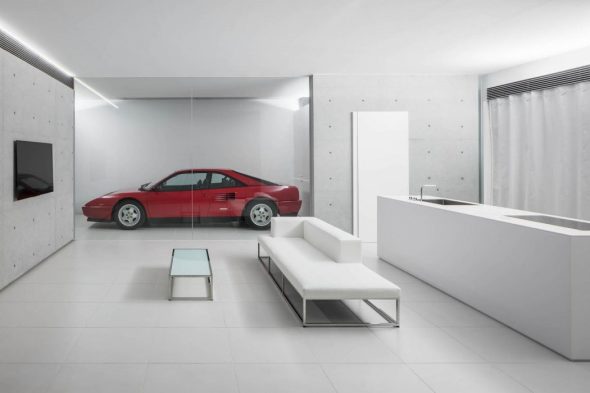
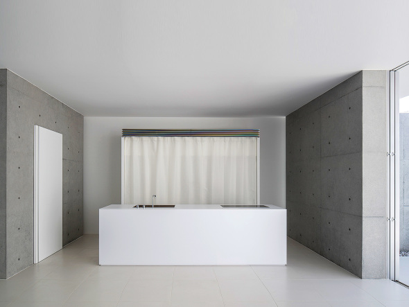
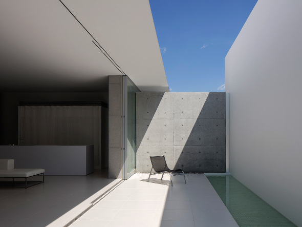
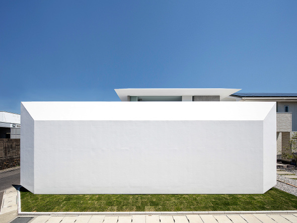
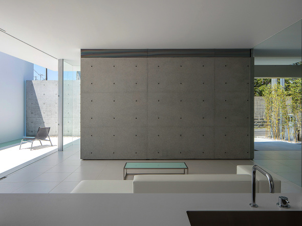
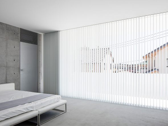
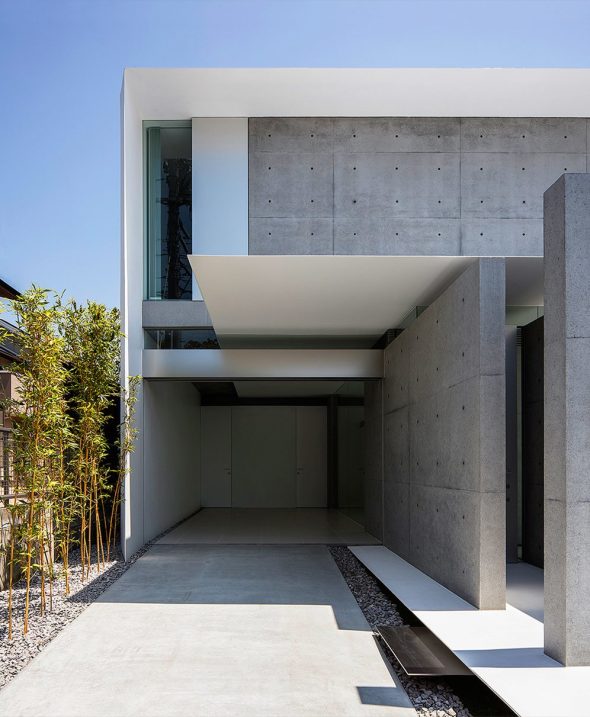
…masterful manipulation of concrete and glass with a penchant for absolute geometry…FU House, Shanan, by Kubota Architect Atelier.
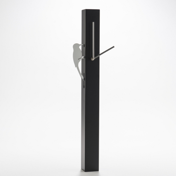
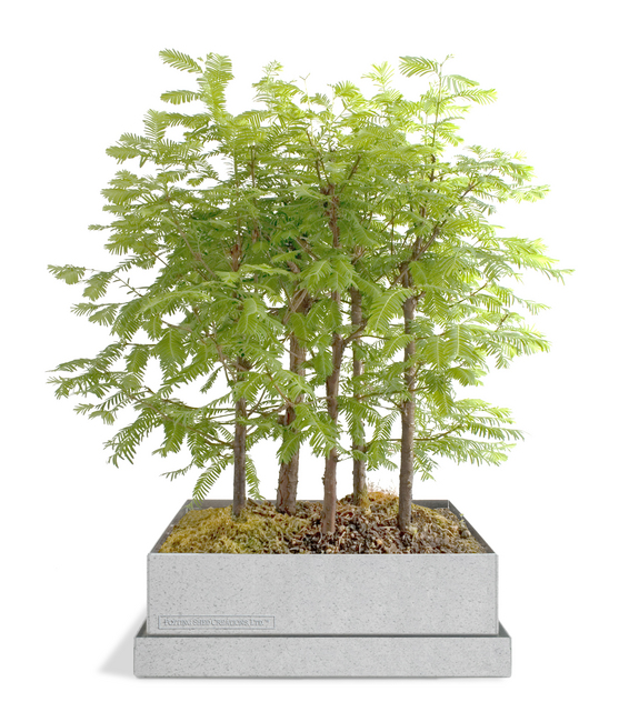
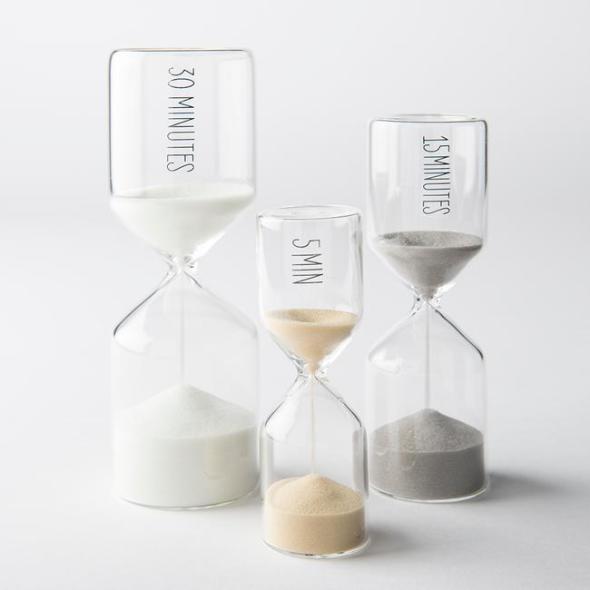
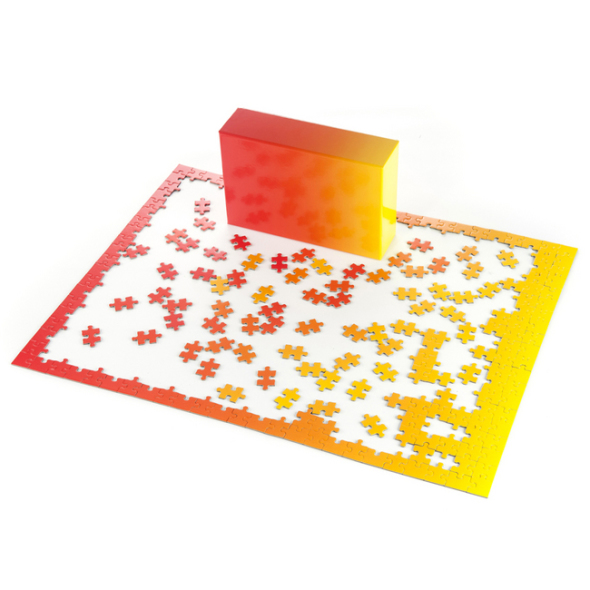
Five Fab Finds…
…all on a budget.
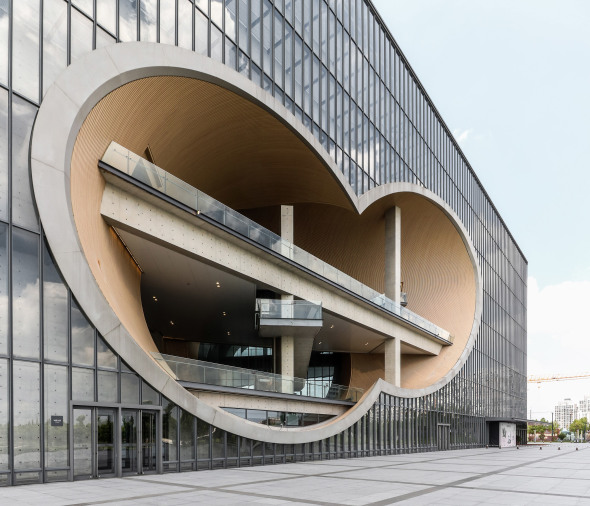
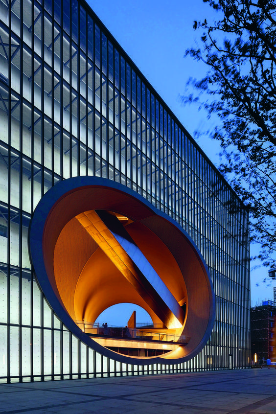
Thought Bubble…
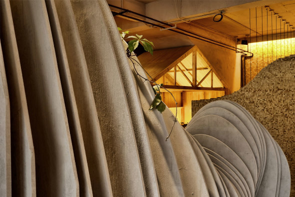
…the careful contemplation and genius of Tadao Ando. The Shanghai Ply Grand Theatre…with its flow of fresh air spaces.
Well, Hello There…
…cabbagerose has returned home from a long hiatus. It is wonderful to be back in residence..but before this season begins in earnest, let’s take a moment to soak in details of this superb penthouse project in Antwerp, by Arjaan de Feyter.
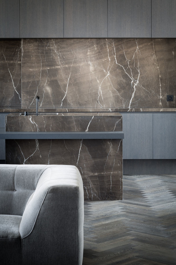
Photography by Thomas de Bruyne. Stone from Graniet en Marmer.
via
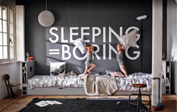
Messages…
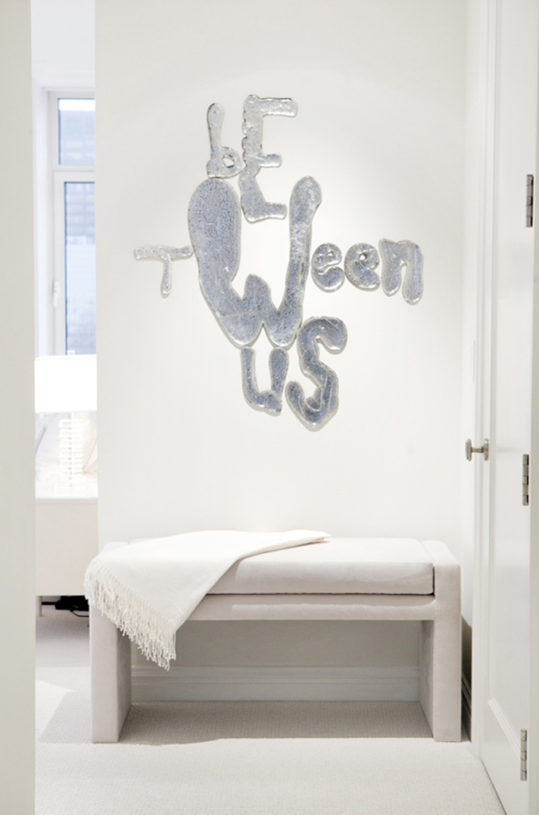
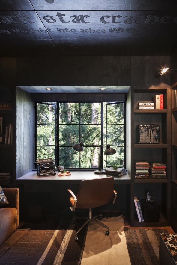
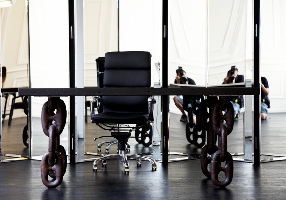
,,,sometimes the writing is on the wall.
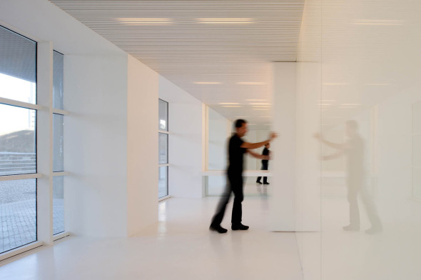
Speechless…
…The Speech Clinic in Lisbon translates as a place of learning and concentration. Here, sound and image are essential elements. It is an empty space filled with a feeling of depth and vibrations…a serene and secure environment for the client; young or old. This simple and beautiful project was developed by MMVarquitecto.
Time Out…
…for tea-time hiking…Ban Shan Café brings the mountains down into Beijing. Robert3 Design selected tactile materials like wood, paper, brick, and ceramic tiles to create a warm, earthy environment. A perfect spot for us to sip a cup of tea and visit. By the way, ‘shan’ means ‘mountain’ in Chinese.
Meow Parlour…
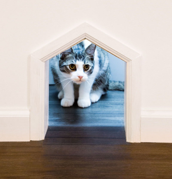
…for the little purrs. Sonya Lee Architect designed NYC’s first cat cafe, Meow Parlour. Here, humans can enjoy a cup of joe while being reminded to play. The kitties roam freely, while awaiting adoption.
The success of the space has led to nearly 100 adoptions, supported by their nonprofit, Kitty Kind, while embracing the idea that good design can shape how we interact with each other and animals. Here, kitty, kitty!…
Easy Living…
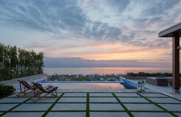
…for a professional athlete and his family. Concrete, wood, breezy white, and the proper accoutrement for the southern California lifestyle…brought to life by Kirkpatrick Architects and Mark J. Williams Design.
Relationship…
…harmony…connection.
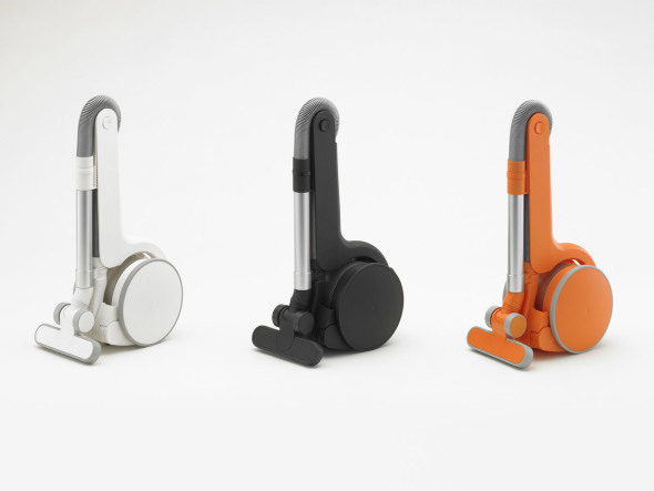
Suck It Up…
…just lift the handle and get busy. Uzu Vacuum is, indeed, eye candy…designed by Japanese design group, Metaphys. Conveniently sized, light (10 lbs.), battery rechargeable, and no cumbersome cord…2005 Good Design Award, 2006 Red Dot Design Award and 2006 JIDA Design Museum selected. Go ahead, suck it up!
Tom Dixon…
…brings bold and modern style to No. 2 Upper Riverside in London. The interiors have been inspired by a sense of Britishness as well as taking into account the building’s unusual geometry.
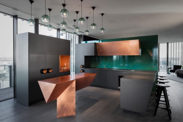
The Tom Dixon kitchen features custom designed enamel splashbacks from the creators of the London Underground enamel signage, combined with copper cabinetry and ironmongery.
Rugged in the ‘Hood…
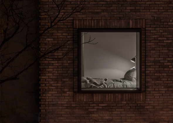
…but not really. 120 Allen Street, on Manhattan’s lower east side is referred to by New York-based, Grzywinski + Pons, as an aparthotel…a hybrid of an apartment and a hotel. The facade fits nicely into the ‘classical grittiness’ of the neighborhood, with the industrial interior being warm, soft, and cozy. The exterior boasts multi-tonal brickwork, zinc panels, coal-fire bricks, rusticated masonry details, and metal louvres.
all images via
Categories
- Architecture (903)
- Art (129)
- Books (7)
- cabbagerose (122)
- Design (257)
- Fashion (89)
- Flowers (14)
- Food (9)
- Guest Post (6)
- Inspiration (394)
- Installation (16)
- Interior Design (687)
- Landscape Architecture (108)
- Music (7)
- Nature (68)
- Pets (26)
- Photography (138)
- Quote (9)
- Retail (36)
- Short Film (5)
- Thank You (3)
- Travel (74)
- Uncategorized (10)
- Urban Development (5)
Archives
- September 2019 (1)
- April 2019 (5)
- March 2019 (1)
- October 2018 (4)
- September 2018 (1)
- March 2018 (3)
- February 2018 (2)
- January 2018 (1)
- December 2017 (2)
- November 2017 (1)
- October 2017 (1)
- August 2017 (1)
- June 2017 (2)
- May 2017 (2)
- March 2017 (2)
- February 2017 (4)
- December 2016 (1)
- November 2016 (6)
- October 2016 (2)
- July 2016 (2)
- May 2016 (8)
- April 2016 (12)
- March 2016 (8)
- February 2016 (6)
- January 2016 (8)
- December 2015 (5)
- November 2015 (2)
- October 2015 (5)
- September 2015 (4)
- August 2015 (9)
- July 2015 (2)
- June 2015 (2)
- May 2015 (5)
- April 2015 (1)
- March 2015 (4)
- February 2015 (9)
- January 2015 (12)
- December 2014 (11)
- November 2014 (17)
- October 2014 (15)
- September 2014 (15)
- August 2014 (21)
- July 2014 (24)
- June 2014 (25)
- May 2014 (22)
- April 2014 (18)
- March 2014 (25)
- February 2014 (23)
- January 2014 (22)
- December 2013 (23)
- November 2013 (19)
- October 2013 (15)
- September 2013 (22)
- August 2013 (16)
- July 2013 (13)
- June 2013 (10)
- May 2013 (28)
- April 2013 (33)
- March 2013 (28)
- February 2013 (30)
- January 2013 (35)
- December 2012 (27)
- November 2012 (32)
- October 2012 (33)
- September 2012 (22)
- August 2012 (19)
- July 2012 (32)
- June 2012 (17)
- May 2012 (33)
- April 2012 (39)
- March 2012 (23)
- February 2012 (10)
- January 2012 (23)
- December 2011 (6)
- November 2011 (6)
- October 2011 (31)
- September 2011 (41)
- August 2011 (29)
- July 2011 (34)
- June 2011 (38)
- May 2011 (38)
- April 2011 (24)

