Fiona Barratt Interiors
Presenting lovely bedrooms from Fiona Barratt Interiors. Which would you choose? I have my favorite. Visit Fiona’s website for her fluid and elegant designs. There is so much more to enjoy. Promise.
kensington
kensington
chelsea apartment
st. johns wood
sw london
Explore
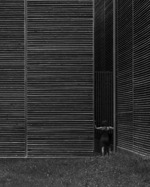
shelters for roman archaeological site ~ peter zumthor architect
The Latest From MINIMAL
MINIMAL has submitted their latest project and it is incredible. Marvel chose MINIMAL for the movie, Transformers 3, to design the kitchen of one of the main characters…the bad guy!
Designer: Stefano Venier
Description: MINIMAL’s cutting edge design featuring a high tech sliding countertop was the perfect fit for Ryan’s, contemporary kitchen in Transformers 3 – Dark of the Moon. With unique Italian sense of aesthetics and commitment to custom design, MINIMAL tailored a kitchen space that perfectly portrays the character’s personality: provocative for its sensual lightness and intimidating for its clean lines.
Designed by Stefano Venier, the kitchen stems out as a full-relief sculpture in the middle of Ryan`s enviable apartment. The focal point of the room is the island, a unique example of technology, design and functionality. Through an electronic movement, the hand crafted Thermo Oak top can be either opened up to serve as an entertainment table or closed to hide the brushed stainless steel countertop, the soldered sink and the retractable faucet.
Technical characteristics:
Doors: White Glossy lacquer, 22 mm (3/4”) thick with 30° top edge
Sliding Counter: Thermo Oak with electronic movement (counter thickness 8cm = 3 1/8”)
Counters: Hand crafted brushed stainless steel, 3 mm (1/8”) thick with soldered sinks and retractable faucet
Appliances: Miele
Hood: Custom by Minimal
Open Shelving: Thin stainless steel shelving system 6mm (1/4”) thick with Thermo oak back panels
Stack It Up
The kiosk is Aesop’s first venture into the American market and was designed by Brooklyn architect Jeremy Barbour of Tacklebox.
The kiosk is located at Grand Central and is made from over 1000 copies of the New York Times. I love the Walt Whitman quote.
Isn’t this an inventive way to use old newspapers?
I love the texture.
Bloom…
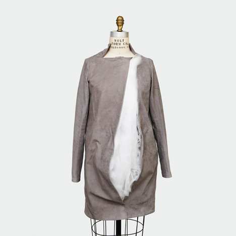
These garments, called Living Pod by Montreal fashion designer Ying Gao curl and unfurl in reaction to light. The project is on show at the Musée national des beaux-arts du Québec in Canada, entitled Ying Gao: Art, Fashion and Technology.
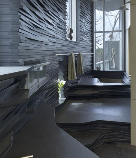
House on a Pond/Schwartz Silver Architects
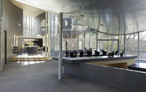
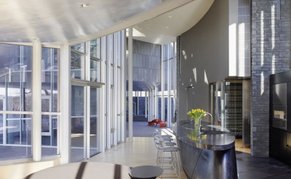
Welcome to House on a Pond in New England by Schwartz/Silver Architects. Be it ever so humble!
via:
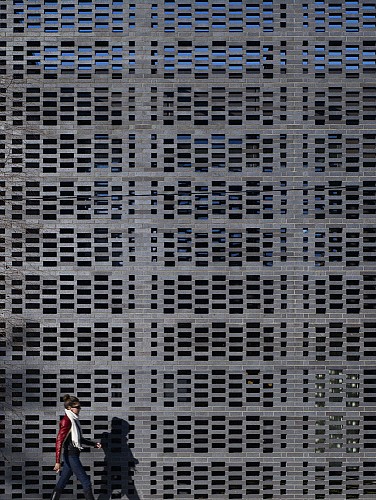
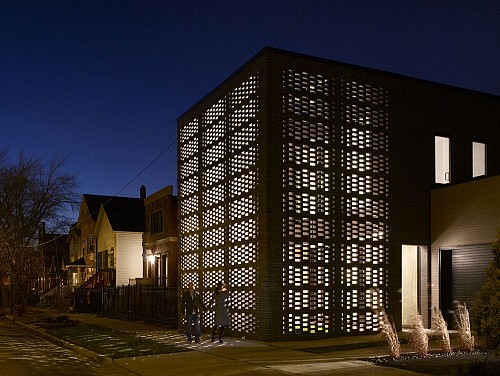
Brick Weave House/Studio Gang
Brick Weave House by Chicago architectural firm, Studio Gang offers an amazing masonry screen which creates privacy for the glass-walled house. I love how it filters sunlight into geometric patterns on the walls and floors.
Color My World
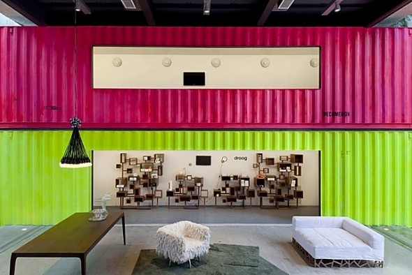
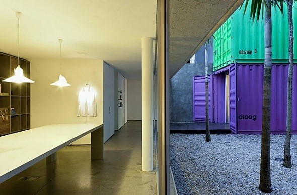
Marcio Kogan was asked to create an inexpensive and quick to build solution for an empty lot in Brazil. The result was the colorful Decameron. The project is a ‘sharp reuse of shipping containers’ and a ‘confident use of color.’
Visiting
I am on my way to the fabulous La Boheme to guest post. If you would like, please come over. Anna and I would love to have you. Have a wonderful day.
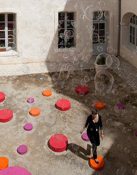
Lively Architecture Festival, Montpelier
At Cabbagerose…
…the door is always open. Thank you for visiting. It is most appreciated.
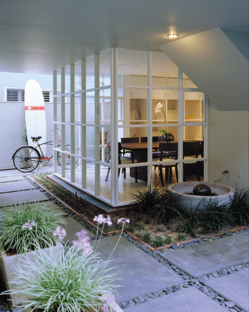
Tigertail by Patrick Tighe Architecture
Categories
- Architecture (903)
- Art (129)
- Books (7)
- cabbagerose (122)
- Design (257)
- Fashion (89)
- Flowers (14)
- Food (9)
- Guest Post (6)
- Inspiration (394)
- Installation (16)
- Interior Design (687)
- Landscape Architecture (108)
- Music (7)
- Nature (68)
- Pets (26)
- Photography (138)
- Quote (9)
- Retail (36)
- Short Film (5)
- Thank You (3)
- Travel (74)
- Uncategorized (10)
- Urban Development (5)
Archives
- September 2019 (1)
- April 2019 (5)
- March 2019 (1)
- October 2018 (4)
- September 2018 (1)
- March 2018 (3)
- February 2018 (2)
- January 2018 (1)
- December 2017 (2)
- November 2017 (1)
- October 2017 (1)
- August 2017 (1)
- June 2017 (2)
- May 2017 (2)
- March 2017 (2)
- February 2017 (4)
- December 2016 (1)
- November 2016 (6)
- October 2016 (2)
- July 2016 (2)
- May 2016 (8)
- April 2016 (12)
- March 2016 (8)
- February 2016 (6)
- January 2016 (8)
- December 2015 (5)
- November 2015 (2)
- October 2015 (5)
- September 2015 (4)
- August 2015 (9)
- July 2015 (2)
- June 2015 (2)
- May 2015 (5)
- April 2015 (1)
- March 2015 (4)
- February 2015 (9)
- January 2015 (12)
- December 2014 (11)
- November 2014 (17)
- October 2014 (15)
- September 2014 (15)
- August 2014 (21)
- July 2014 (24)
- June 2014 (25)
- May 2014 (22)
- April 2014 (18)
- March 2014 (25)
- February 2014 (23)
- January 2014 (22)
- December 2013 (23)
- November 2013 (19)
- October 2013 (15)
- September 2013 (22)
- August 2013 (16)
- July 2013 (13)
- June 2013 (10)
- May 2013 (28)
- April 2013 (33)
- March 2013 (28)
- February 2013 (30)
- January 2013 (35)
- December 2012 (27)
- November 2012 (32)
- October 2012 (33)
- September 2012 (22)
- August 2012 (19)
- July 2012 (32)
- June 2012 (17)
- May 2012 (33)
- April 2012 (39)
- March 2012 (23)
- February 2012 (10)
- January 2012 (23)
- December 2011 (6)
- November 2011 (6)
- October 2011 (31)
- September 2011 (41)
- August 2011 (29)
- July 2011 (34)
- June 2011 (38)
- May 2011 (38)
- April 2011 (24)


