On the Pacific…
…Architectural geometry and photography go hand in hand, as portrayed in the exemplary project by ANDO Corporation known as “Rooms.” This fabulous contemporary residence rises in Wakayama, Japan and occupies 288 square meters – enough space to become an airy, minimalist cluster of rooms perfect for living an uncomplicated lifestyle.
Surrounded by lush vegetation gently sloping down the hillside, the white volumetric residence benefits from a spectacular play of geometry in the front garden leading inside to the brightly lit spaces. Overlooking the Pacific Ocean, the modern home seems to defy its surroundings with an imposing shape while visually connecting with it from different vantage points at the same time. Interior spaces are split into separate blocks connected by a terrace and a covered walkway, ending with an oceanview pool that completes this minimalist dream home.
Fresh Air…
…mmmm…fresh air, albeit chilly, and a healthy dose of sunshine. Things are looking good. Happy Thursday.
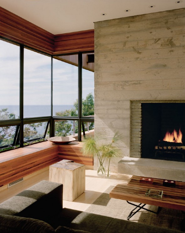
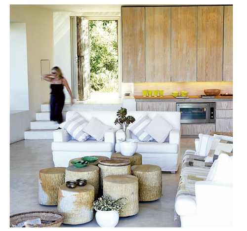
bluff house/robert young architecture & interiors
Keep Your Eyes Open…
…for the creative genius of ROVVEL, interior design by Anna Korkobcova & Kat VanCleave in San Francisco. ROVVEL, (Revolve, Evolve, Rebel) aesthetic combines simplicity of form with the complexity of light, scale, texture, and color. While remaining aware of the relationship of the human body in space, the team is drawn to refined, smart and sexy designs. ROVVEL…remember where you heard it first…
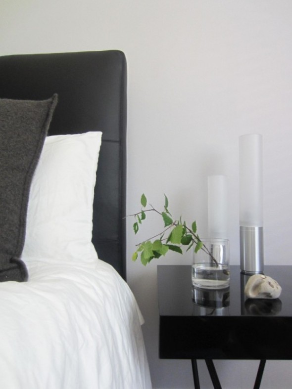
hillsborough, california
Darn, I Like This…
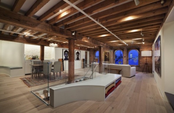
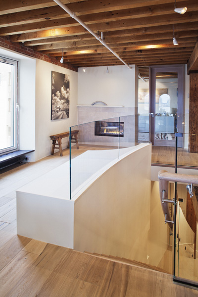
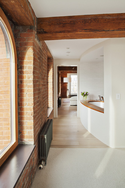
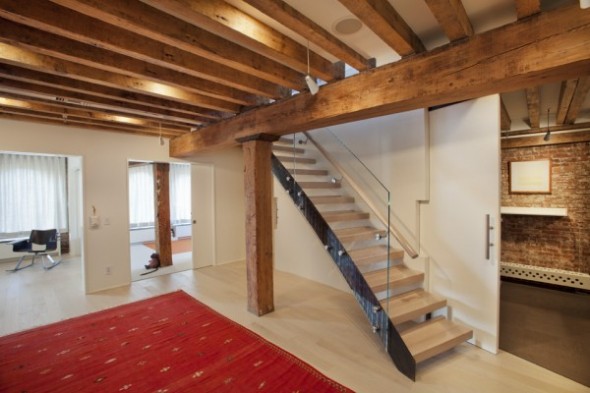
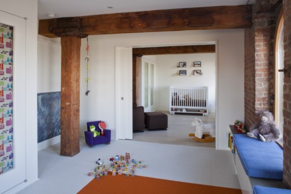
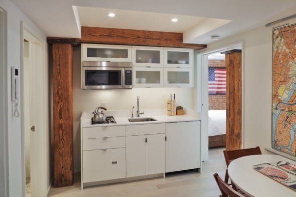
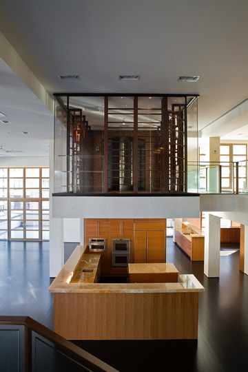
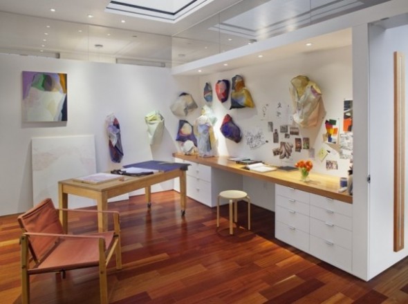
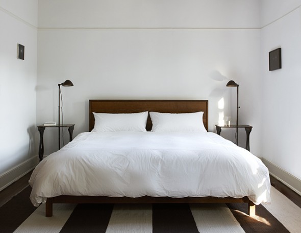
…I have a personal bias when I see “too much” wood in a space. It can get in my way…especially oak. But darn, I like this…I find this heavy use of wood visually appealing, warm, and modern. Kudos to Mabbott Seidel Architecture in New York for helping me see custom millwork in a new light…particulary when combined with concrete and brick…and placed in outstanding projects nestled along the Hudson River…
…hudson river duplex…above guest kitchenette…
…tribeca duplex with cantilevered wine + humidor room…
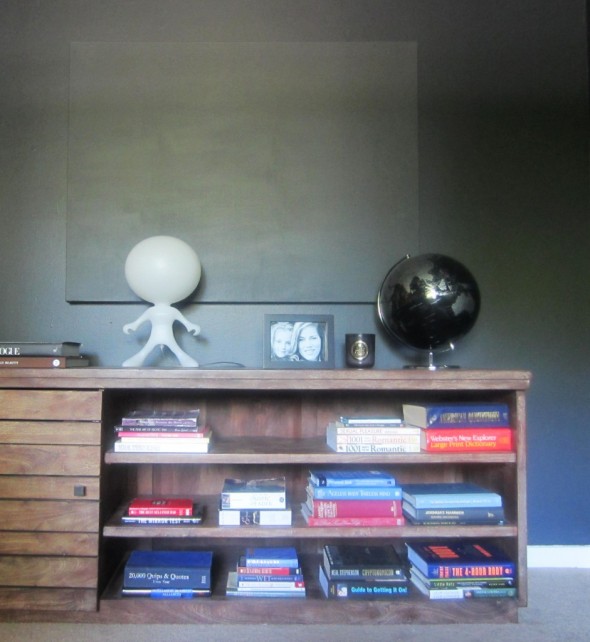
…painting studio…
…simple bed…
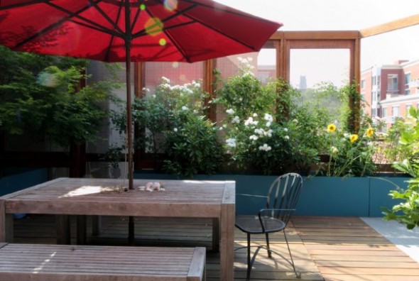
…roof terrace 2…
all images courtesy of mabbott seidel
Live and Blossom…
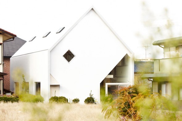
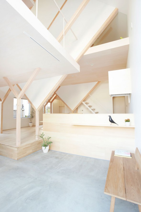
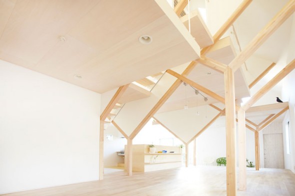
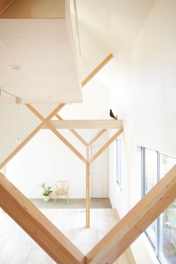
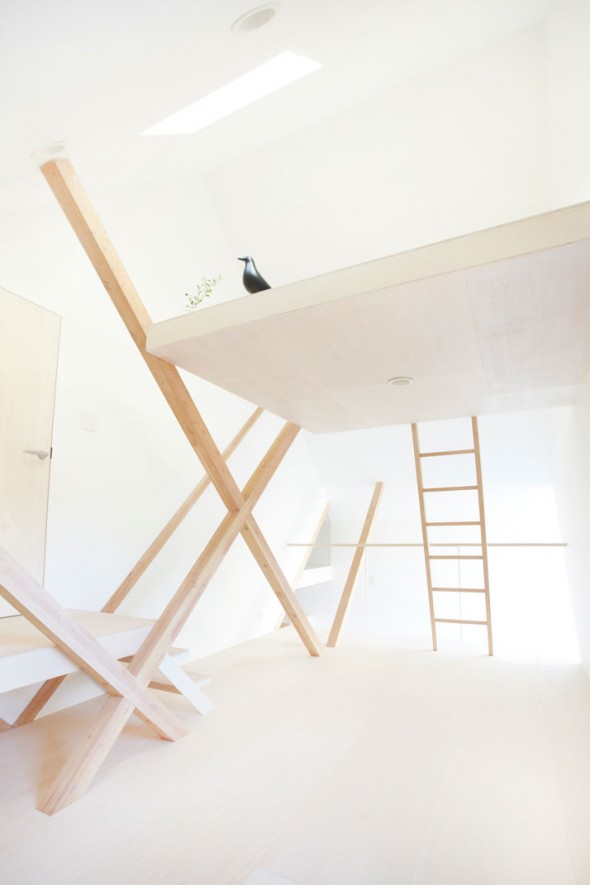
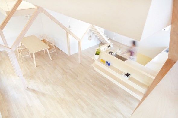
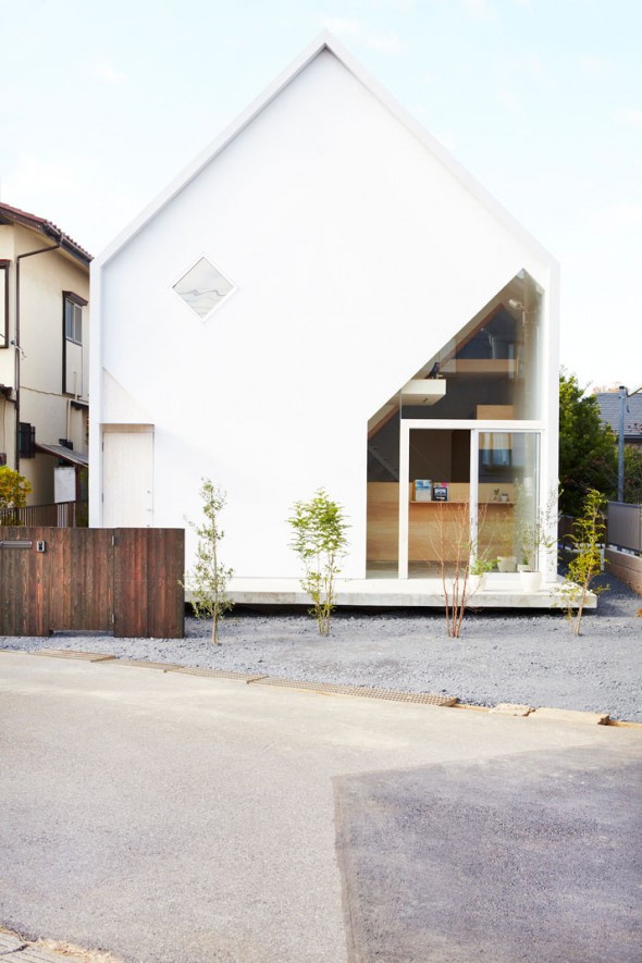
…This home from the ’60’s has been creatively reinterpreted, based on this family’s needs and desires to create the perfect space in which they can live and blossom everyday for years to come…airy and poetic, House H by Hiroyuki Shinozaki Architects in Matsudo, Chiba, Prefecture, on the outskirts of Tokyo…
Styling For the Architect/Designer…
…hey, what’s this? The first of a new series of smart dressing for the architect/designer…this time a collaboration with the mecca of fashion, DIANI, located in Santa Barbara. This is just a small taste of offerings…if you have a minute, please visit the DIANI blog and beautiful website . You won’t be disappointed…I promise…double promise…
…I have my favorites chosen. Thank you to the talented stylists at DIANI…
One of My Favorite Things…
…I have a real thing for Irish moss…absolutely adore it…love to run my fingers through that tosseled mop of green. Happy St. Patrick’s Day…today, we are all Irish, yes?
Irish moss and planter available here
Gorgeous…
…seems a bit of an understatement, yes?…especially since I’m near hyperventilation…Karl Lagerfeld for Cassina…KL’s first collaboration with a furniture designer…
…wow…
May I Ask a Question?…
…this exciting project for Pulsate, a small tile showroom in London’s Primrose Hill, by LIly Jencks and Nathanael Dorent gets my heart pumping…for reasons other than you might think. Uber-creative and wildly imaginative, Jencks and Dorent have teamed up and fitted out a tile showroom in London to look like a psychedelic cartoon. I love it…
Drawing inspiration from the mind-boggling images of Op Art and Gestalt psychology, the tiles are laid out in a zigzagging pattern that warps perspective at the back of the space.
…and in I go…no doubt, I would be drawn in by this masterpiece…
“We had the idea of a shop not being only a functional space for consumption, but more about architecture and adventure,” said Dorent. “The floor is sloped, and benches are built into the structure, so you’re never really sure what you’re looking at.”
…and this is where I imagine I could end up if I walk through this mind-bending execution of tile…
…and, may I ask a question? Can anyone explain to me why I feel sea-sick when I walk under The Bean?
It’s Friday…
…time to LOL…and, please, don’t stop…
east london house extension/david mikhail architects
Time Out…
…Lay, oh- de- lay, oh- de- lay hee hoo!…peak skiing at The Hotel Madlein, in Ischgl, Austria. Madlein in the first designer hotel in the Tyrolean Alps. Pack your bags…
Checking in At the Office…
…it is Monday…back to work.
Gothic Office, Portland/Jessica Helgerson Interior Design
Categories
- Architecture (903)
- Art (129)
- Books (7)
- cabbagerose (122)
- Design (257)
- Fashion (89)
- Flowers (14)
- Food (9)
- Guest Post (6)
- Inspiration (394)
- Installation (16)
- Interior Design (687)
- Landscape Architecture (108)
- Music (7)
- Nature (68)
- Pets (26)
- Photography (138)
- Quote (9)
- Retail (36)
- Short Film (5)
- Thank You (3)
- Travel (74)
- Uncategorized (10)
- Urban Development (5)
Archives
- September 2019 (1)
- April 2019 (5)
- March 2019 (1)
- October 2018 (4)
- September 2018 (1)
- March 2018 (3)
- February 2018 (2)
- January 2018 (1)
- December 2017 (2)
- November 2017 (1)
- October 2017 (1)
- August 2017 (1)
- June 2017 (2)
- May 2017 (2)
- March 2017 (2)
- February 2017 (4)
- December 2016 (1)
- November 2016 (6)
- October 2016 (2)
- July 2016 (2)
- May 2016 (8)
- April 2016 (12)
- March 2016 (8)
- February 2016 (6)
- January 2016 (8)
- December 2015 (5)
- November 2015 (2)
- October 2015 (5)
- September 2015 (4)
- August 2015 (9)
- July 2015 (2)
- June 2015 (2)
- May 2015 (5)
- April 2015 (1)
- March 2015 (4)
- February 2015 (9)
- January 2015 (12)
- December 2014 (11)
- November 2014 (17)
- October 2014 (15)
- September 2014 (15)
- August 2014 (21)
- July 2014 (24)
- June 2014 (25)
- May 2014 (22)
- April 2014 (18)
- March 2014 (25)
- February 2014 (23)
- January 2014 (22)
- December 2013 (23)
- November 2013 (19)
- October 2013 (15)
- September 2013 (22)
- August 2013 (16)
- July 2013 (13)
- June 2013 (10)
- May 2013 (28)
- April 2013 (33)
- March 2013 (28)
- February 2013 (30)
- January 2013 (35)
- December 2012 (27)
- November 2012 (32)
- October 2012 (33)
- September 2012 (22)
- August 2012 (19)
- July 2012 (32)
- June 2012 (17)
- May 2012 (33)
- April 2012 (39)
- March 2012 (23)
- February 2012 (10)
- January 2012 (23)
- December 2011 (6)
- November 2011 (6)
- October 2011 (31)
- September 2011 (41)
- August 2011 (29)
- July 2011 (34)
- June 2011 (38)
- May 2011 (38)
- April 2011 (24)


